Project Recover’s New Logo
Greetings –
We are proud to announce Project Recover has a brand new logo!
You may have already noticed the new logo on some of our social media platforms. We were very attached to our old logo. However, as the organization continues to grow, we wanted something new to match.
We opted for a design that is bold, easily recognizable, and has utility across multiple mediums. A special thanks to Freeman Ryan Design for their support in creating exactly what we were looking for.
Learn More – (Click Here)
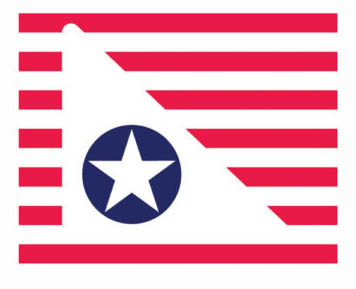
The logo is highly symbolic.
The red, white, and blue colors represent our nation.
The horizontal stripes represent our high-frequency side-scan sonar (SSS) pattern of sound waves as we survey the seafloor.
The triangle reminds us of the folded American flag we bestow to our MIA families. It also reminds us of the vertical stabilizer on the aircraft we locate.
The single star represents the fallen for whom we search as well as their Gold Star families.
“This new logo is simple, distinct, recognizable, meaningful, and has utility, too,” said Project Recover President, Derek Abbey, Ph.D.
Thank you for your support of Project Recover.
The Project Recover Team
www.ProjectRecover.org